Excel me graph kaise banaye : how to gantt chart excel or how to make a pie chart in excel)
How to Gantt Chart Excel:
Make Graph and Make Pie Chart in Excel – Gantt charts are powerful tools for visualizing project schedules and timelines in Excel. With Excel’s built-in features, creating a Gantt chart is a straightforward process. Here’s how to create a Gantt chart in Excel:
How to Make a Graph in Excel (Excel me graph kaise banaye):
Graphs, also known as charts, are essential for visually representing data in Excel. Whether you’re plotting data points on a line graph or comparing values on a bar chart, Excel offers a variety of graph types to suit your needs. Here’s how to make a graph in Excel:
How to Make a Pie Chart in Excel:
Pie charts are effective for illustrating proportions and percentages in Excel. Whether you’re showcasing market share or distribution of resources, Excel’s pie chart feature makes it easy to create visually appealing representations of your data. Here’s how to make a pie chart in Excel:
How to Chart in Excel:
Charting data in Excel allows you to present information in a visually compelling manner. Excel offers a wide range of chart types, including bar graphs, line charts, scatter plots, and more. Here’s how to chart data in Excel:
Table of Contents
1. Introduction to Excel Charts
Excel me graph kaise banaye : Before we dive into creating charts, let’s understand the basics of Excel charts. A chart is a graphical representation of data, making it easier to spot patterns, trends, and relationships. Excel offers a wide range of chart types, including line charts, bar charts, pie charts, scatter plots, and more.
To create a chart in Excel, you need to have data ready in a table format. You can use data from a single column or multiple columns, depending on the type of chart you want to create.
2. Creating a Basic Line Graph
A line graph is ideal for showing trends and changes over time. To create a line graph in Excel, follow these steps:
- Select the data you want to include in the graph.
- Click on the “Insert” tab in the Excel ribbon.
- Click on the “Line Chart” button, and select the desired line chart type.
Excel will generate a line graph based on your selected data.

3. Building a Bar Graph in Excel
A bar graph is useful for comparing data among different categories. To create a bar graph in Excel:
- Organize your data in a table format with categories in one column and corresponding values in another.
- Select the data range.
- Click on the “Insert” tab, and choose the “Clustered Bar Chart” option.
Excel will create a bar graph representing your data.
4. Making a Pie Chart in Excel
Pie charts are effective for displaying the proportion of different categories within a dataset. To create a pie chart in Excel:
- Arrange your data with categories in one column and their respective values in another.
- Select the data range.
- Click on the “Insert” tab, and choose the “Pie Chart” option.
Excel will generate a pie chart based on your data, representing the percentage of each category.
To learn how to extract numbers from a string in Excel, check out our comprehensive guide on Extracting Numbers from String in Excel.
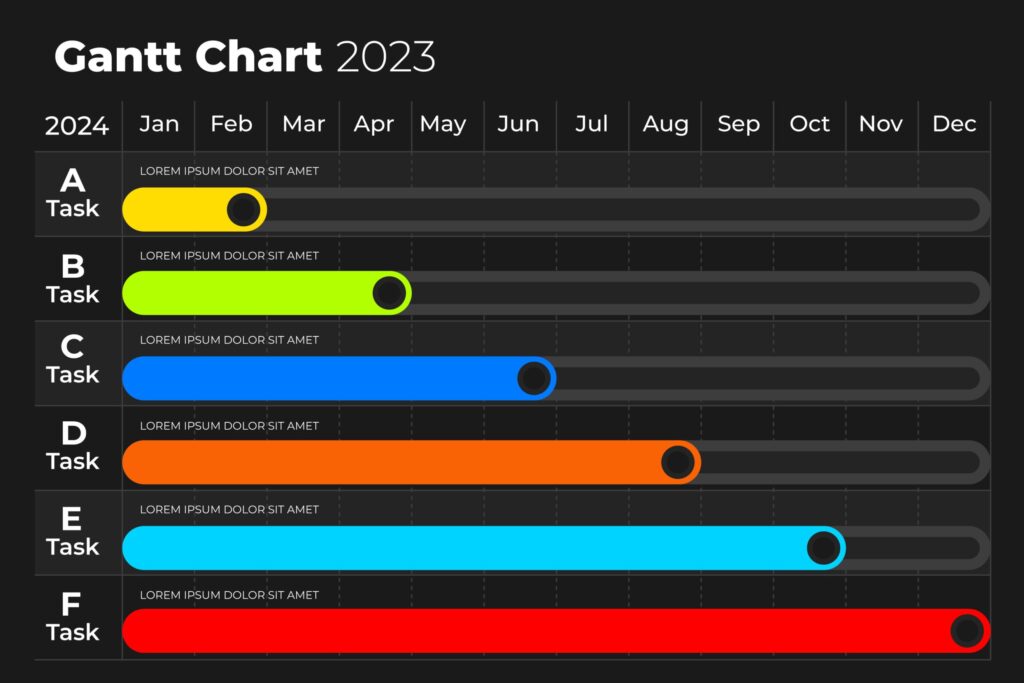
5. Constructing a Gantt Chart in Excel
Gantt charts are excellent for visualizing project schedules and timelines. To create a Gantt chart in Excel:
- Prepare a table with tasks, start dates, durations, and end dates.
- Select the data range.
- Click on the “Insert” tab, and choose the “Stacked Bar Chart” option.
Excel will create a Gantt chart displaying your project timeline.
6. Adding Elements to Your Charts
6.1 Adding Data Labels
Data labels provide additional information about data points in a chart. To add data labels:
- Click on the chart to select it.
- Click on the “+” icon next to the chart.
- Check the “Data Labels” box.
6.2 Adding Trend Lines
Trend lines show the general direction of data trends. To add a trend line:
- Click on the chart to select it.
- Click on the “+” icon next to the chart.
- Check the “Trendline” box.
6.3 Adding Axis Labels and Titles
Axis labels and titles help to provide context to your chart. To add axis labels and titles:
- Click on the chart to select it.
- Click on the “Chart Elements” button (a plus-shaped icon) in the top-right corner of the chart.
- Check the “Axis Titles” box.
6.4 Adding Legends
Legends identify different data series in the chart. To add a legend:
- Click on the chart to select it.
- Click on the “Chart Elements” button.
- Check the “Legend” box.
6.5 Adding Secondary Axis
A secondary axis is useful when you have data with different scales. To add a secondary axis:
- Click on the chart to select it.
- Click on the “Chart Elements” button.
- Check the “Secondary Axis” box.
7. Customizing Your Charts
Excel allows you to customize your charts to match your specific needs. Here are some customization options:
7.1 Changing Chart Type
You can easily change the chart type without re-entering your data. To change the chart type:
- Click on the chart to select it.
- Click on the “Change Chart Type” button in the Excel ribbon.
- Choose the desired chart type.
7.2 Formatting Chart Elements
You can modify various elements of your chart, such as colors, fonts, and styles. To format chart elements:
- Click on the chart element you want to format.
- Right-click and choose “Format <element name>.”
7.3 Using Chart Templates
Excel offers pre-designed chart templates to save time and create consistent visuals. To use a chart template:
- Click on the chart to select it.
- Click on the “Chart Elements” button.
- Choose “Templates” and select a template.
8. Advanced Charting Techniques
8.1 Creating Sparklines
Sparklines are mini-charts that fit within a single cell, allowing you to visualize data trends at a glance.
To create sparklines in Excel:
- Select the cell where you want the sparkline to appear.
- Click on the “Insert” tab, and choose the “Sparklines” option.
- Select the data range for the sparkline, and choose the sparkline type (e.g., line, column).
8.2 Building Combination Charts
Combination charts combine different chart types in a single chart. For example, you can display both bar and line charts together.
To create a combination chart:
- Select the data you want to include in the chart.
- Click on the “Insert” tab, and choose the “Combo Chart” option.
- Select the chart types for each data series.
8.3 Designing Waterfall Charts
Waterfall charts are used to visualize changes in a value over time, illustrating the cumulative effect of positive and negative contributions.
To create a waterfall chart:
- Organize your data in a table format with categories and values.
- Click on the “Insert” tab, and choose the “Waterfall Chart” option.
9. Utilizing Pivot Charts
Pivot charts are created from PivotTables, allowing you to summarize and analyze data easily. To create a pivot chart:
- Select your data range.
- Click on the “Insert” tab, and choose the “PivotChart” option.
- Follow the PivotTable wizard to set up your desired chart.
10. Tips for Effective Data Visualization
- Use the appropriate chart type for your data and purpose.
- Keep your charts simple and clutter-free.
- Use descriptive titles and labels to make your charts easy to understand.
- Ensure consistency in colors and fonts across your charts.
- Avoid using 3D effects that can distort data representation.
- Regularly update your charts as new data becomes available.
11. Conclusion
Excel charts are indispensable tools for data visualization and analysis. By following this step-by-step guide, you’ve learned how to create various types of charts in Excel, from basic line graphs to advanced Gantt charts and waterfall charts. With practice and experimentation, you can master Excel charts and effectively communicate insights from your data.
Discover how to remove duplicates in Excel with our step-by-step guide on Removing Duplicates in Excel.
Remember, practice makes perfect, so keep exploring Excel’s charting capabilities to become a true Excel charting pro! Happy charting!
Frequently Asked Questions (FAQs) – Mastering Excel Charts
1. How do I create a chart in Excel?
Creating a chart in Excel is simple. First, select the data you want to include in the chart. Then, click on the “Insert” tab in the Excel ribbon and choose the desired chart type from the options available.
2. How do I add data labels to my chart?
To add data labels to your chart, select the chart and click on the “+” icon next to it. Check the “Data Labels” box to display labels with the data points.
3. Can I customize the appearance of my chart in Excel?
Yes, Excel allows you to customize your charts extensively. You can change colors, fonts, chart type, and other elements to match your preferences and data visualization needs.
4. How do I create a pie chart in Excel?
To create a pie chart in Excel, arrange your data with categories in one column and corresponding values in another. Select the data range and click on the “Insert” tab, then choose the “Pie Chart” option.
5. What is a Gantt chart, and how do I make one in Excel?
A Gantt chart is a visual representation of project schedules and timelines. To create a Gantt chart in Excel, prepare a table with tasks, start dates, durations, and end dates. Select the data range and click on the “Insert” tab, then choose the “Stacked Bar Chart” option.
6. How can I add a trend line to my chart in Excel?
To add a trend line, select the chart, click on the “+” icon, and check the “Trendline” box. Excel will automatically calculate and display the trend line based on your data.
7. Can I use chart templates in Excel?
Yes, Excel offers pre-designed chart templates that you can use to save time and create consistent visuals. Click on the chart, click on the “Chart Elements” button, and choose “Templates” to select a template.
8. What are sparklines, and how do I create them in Excel?
Sparklines are mini-charts that fit within a single cell to visualize data trends at a glance. To create sparklines, select the cell where you want the sparkline to appear, click on the “Insert” tab, and choose the “Sparklines” option.
9. How do I create a combination chart in Excel?
A combination chart combines different chart types in a single chart. Select the data you want to include, click on the “Insert” tab, and choose the “Combo Chart” option. Then, select the chart types for each data series.
10. What is a waterfall chart, and how can I create one in Excel?
A waterfall chart illustrates changes in a value over time, showing the cumulative effect of positive and negative contributions. To create a waterfall chart, organize your data in a table format and click on the “Insert” tab, then choose the “Waterfall Chart” option.
11. How can I use pivot charts in Excel?
Pivot charts are created from PivotTables, allowing you to summarize and analyze data easily. Select your data range, click on the “Insert” tab, and choose the “PivotChart” option. Follow the PivotTable wizard to set up your desired chart.
12. Any tips for effective data visualization using Excel charts?
Use the appropriate chart type for your data and purpose.
Keep your charts simple and clutter-free.
Use descriptive titles and labels to make your charts easy to understand.
Ensure consistency in colors and fonts across your charts.
Avoid using 3D effects that can distort data representation.
Regularly update your charts as new data becomes available.
If you have any other questions or need further assistance, feel free to ask!
- Excel Not Responding How Will You Troubleshoot It? Find Solution How to Fix it (2024)
- How to Filter Data in Excel | Excel Sheet Me Filter Kaise Lagaye
- How to Compare Two Excel Worksheets to Find the Differences
- Excel tutorial on How to Compare 2 Columns in Excel for differences
- Mastering Excel: A Comprehensive Guide on How to Hide Excel Worksheets
- Mastering Excel Mishaps: How to Recover an Unsaved Excel Document in 20 Seconds
- Mastering Excel: Applying Formulas to Entire Columns Like a Pro
- Mastering Decimal Places in Excel Formulas (how to set decimal places in excel formula)
- How to calculate percentage in excel (Excel me Percentage ka Formula)
- Excel me graph kaise banaye : how to gantt chart excel or how to make a pie chart in excel)

You May Also Like